Here is the first digital work I'm posting in quite some time. I've been trying to get back into the groove of things, so to speak. Hopefully I'll be able to keep this place updated a little more as well. This is essentially a character I came up with for a concept project for my class. It took a while and I'm still not too thrilled with it. I'm really having a hard time learning the ins and outs and finding a way to proceed every time I start a digital piece. Not to mention still having issues understanding the nuances of color. Hopefully I find a comfort zone.
Saturday, May 5, 2012
Thursday, October 6, 2011
Recent quick studies.
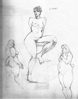
Been a while since I've updated again. Hopefully I'll be more consistent from this point forward. In any case, here are some recent quick studies I did at a few workshops at my school.
Friday, April 8, 2011
Poster concept for local street fair.
So here is a poster concept I did for the annual Haight Ashbury Street Fair that is held here in San Francisco. All in all I feel "okay" with the results. I haven't used Illustrator that much (been learning for only two months) and I learned a lot of do's and don'ts during this assignment. The reaction from my classmates for this one was mixed. I put a lot and time and effort into this piece though so even if I don't do well in the contest (there are a lot of good ones out there) I still don't feel that bad. Next time though I'm definitely going to use the line tool more instead of taking my chances with the blob tool the majority of the time.


Friday, March 18, 2011
Here are some figure drawings.
These are some figure drawings from my clothed figure class. I definitely have more trouble drawing bigger and there is no question I have more trouble drawing figures with clothes on. It's really hard to prepare for something so random and unexpected. In any case, hopefully I get better. I still want to find ways to work with basic shapes and keep that strategy in mind. From what I've learned and observed from others, that may be a good approach to go about things.


Friday, March 11, 2011
Digital character design.
So this is one of my first character designs I did in photoshop. Not to thrilled about it, but whatever. I've always been apprehensive about anything involving color...even when it's made easier in Photoshop. Of course I know I can't just limit myself and I'm going to have to branch out and study more about color theory and such. Photoshop definitely makes it easier and I believe I'm learning more and more as I go. My confidence has gotten a little higher I suppose. On this piece I had some help from my teacher and a friend with the fire. I mostly used a round...I like it a lot for some reason, but of course I plan toy with other brushes in the future.


Friday, February 18, 2011
Another watercolor piece.

I did this a few months ago when I was taking a class and trying to learn watercolor. It's the same class where the previous piece I posted came from. Watercolor was definitely a struggle for me, and I'm not sure I'll ever get into it again. Which is a shame because it looks like a great medium. At this point in time it's not where I want to lend my focus to though. As for this piece, I'm not too thrilled about it, but I thought I would post it because it's one of the two I kind of liked that I did in class. Whatever.
Thursday, February 3, 2011
Haven't posted in a while, but here is something.
I really need to do a better job of keeping this updated. At least a couple of times per month. Even if I have one follower, it's still important to keep the ball moving. In any case, here is a sketch I did of Hong Kong movie star Gong Li. I tried to go with a comic book style (since that is what I want to gravitate towards overall as a career path) rendition. Doesn't look like her that much, but whatever. I got tired of working on it and unfortunately I'm not at the level yet where I can do good likenesses of people in comic-form. Trying to follow in the footsteps of David Finch...but it's hard work. Aside from the anatomy issues I think I overworked her hair. I really need to change the way I render. Maybe more of a pure scribble instead of lines in the same direction. Cleaned it up in photoshop (which was hurtful to my ego).This is actually a portfolio piece for my Chinese-speaking class. Hopefully my teacher finds it interesting.


Subscribe to:
Comments (Atom)


